Posts Tagged ‘woodcut’

Tavern on the Green Logo Identity by Steven Noble

Friday, December 13th, 2013

For their reboot of Tavern on the Green, owners Jim Caiola and David Salama wanted Steven Noble to create a logo that felt contemporary while still referencing the restaurant’s storied past. The logo will be used throughout the restaurant on menus and business cards, as well as on the restaurant’s famous red awnings through how they tweaked each iteration of the logo — beginning with the first prelimnary draft — before landing on this final look.

Tavern on the Green was originally built as a sheepfold in current day Central Park . The sheep were actually held there at night and let out on Sheep Meadow during the day to graze and mow the lawn. Since we were going for this farm to table concept, the sheep really were a good vision for that sort of food.

The idea was to contemporize the Tavern on the Green brand. But they always knew they were ode-ing to the sheep. There was a history they were trying to acknowledge with the crest and the animals. When you see this, you think of a family’s history or a place’s history, so they liked this idea.

The final design feels timeless, but also contemporary. It feels fun, but not too self-conscious. It’s beautiful and modern and clean.

Driscoll’s: a ‘Fresh Look’ of Fresh Berries

Wednesday, October 13th, 2010

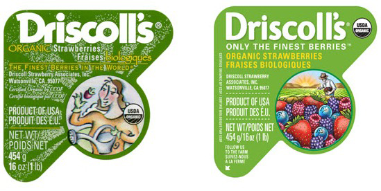
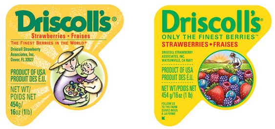
Driscoll’s, the leading provider of fresh berries, unveiled a new logo and label design that will be used throughout all areas of sales and marketing. The new look will begin to hit the U.S. market within the next few weeks.

The new brand identity will be incorporated in various brand communications from labels on individual clamshells, to the trays used to ship the clamshells as well as signage at the company’s headquarters. The new brand identity will unify and strengthen the look of Driscoll’s destination Berry Patch displays in retail stores.

The company tapped San Francisco-based Michael Osborne Design for the task. Osborne and his team retained key brand and label design touch points, such as the familiar triangle shaped label, and the vibrant yellow and green background colors, while restructuring messaging in a hierarchical fashion on the labels. The new label also incorporates an illustration, created by Steven Noble, of a farmer in a field of berries and most important, berries overflowing in a basket.

This is the evolution of this brand,” said Douglas Ronan, VP Marketing at Driscoll’s. “The Driscoll’s brand is one of the most recognized brands in the produce industry. Our heritage is in strawberries. Now, by using all four berries on our package, we are reinforcing our leadership position in fresh berries while highlighting the special efforts of our farmers.”

SKYY SPIRITS BRINGS AWARD-WINNING ESPOLON™ TEQUILA BACK TO U.S. FANS POPSOP.COM

Thursday, August 19th, 2010

Iconic Tequila Brand Returns with Same Great Liquid Presented in Updated Packaging with Imagery that Celebrates
“Real Mexico”

espolon_tequila_new1

SAN FRANCISCO (May 3, 2010) – Espolón™, the super-premium tequila that evokes the storied culture of “real Mexico,” is returning to the U.S. market. Skyy Spirits, the U.S.-based wholly owned subsidiary of Gruppo Campari and the definitive marketer and distributor of super-premium and luxury spirits brands in North America, is proud to bring this 100-percent Weber Blue Agave tequila brand north of the border again with a new look, yet with the same award-winning liquid.

Espolón was originally introduced in the United States in 2000, garnering praise from Tequila experts and winning a Double Gold Medal at the San Francisco World Spirits Competition as well as a Platinum Rating by the Beverage Testing Institute. Gruppo Campari, who in 2009 bought the Espolón brand along with the San Nicolas Distillery where it is made, is reintroducing the brand following a three year hiatus in the US.

While Espolón’s liquid remains the same, the packaging and look/feel of the brand have been redesigned and repositioned, with a focus on trumpeting life in real Mexico. The new decorative label on each Espolón bottle illustrated by Steven Noble pays tribute to the Mexican artists who inspired the world with true portrayals of the country’s rich history and complex everyday life. Striking, stark block print artwork features the characters of Guadalupe, Rosarita and the proud rooster, Ramón, reliving Mexico’s rich cultural stories.

The Espolón Blanco label, entitled “Independencia,” illustrates Guadalupe and Rosarita joining Father Miguel Hidalgo’s valiant campaign for Mexican independence from Spain. The Espolón Reposado label tells the story of “recuerdo” (“remembrance”), in which Guadalupe and Rosarita grace the markets of Mexico City, the new metropolis built on the fallen Aztec capital. Here, the couple schemes to infuse elements of Aztec culture into every market to ensure the remembrance of that great society. The labels serve to provide history and offer insight into the rich and fascinating stories of real Mexico.

AdPulp: Sell! Sell! in London is helping Fentimans, the independent Hexham-based soft drinks company, tug Coca-Cola’s long white beard this Christmas.

Monday, August 2nd, 2010

fentiman_s-fighting-santas

Created by Sell! Sell!, the ad depicts an old-fashioned illustration created by Steven Noble of a Fentimans Santa wearing the colours of Curiosity Cola and workman’s boots standing victorious over a chubby Father Christmas lying prostrate and dressed in his customary red outfit much championed and featured by Coca Cola.

Vic Polkinghorne, creative director of Sell! Sell!, commented “Fentimans make great soft drinks but they’re in a market that’s dominated by big brands and heavy spenders. To make their budgets work as hard as possible they need something cheeky or provocative to help them cut through the blizzard of Christmassy nonsense that’s spewed forth at this time of year”.

Brand New: A Clawed, Orange Crustacean is Worth a Thousand Words

Monday, August 2nd, 2010

Remember the mid- to late-1990s? When everyone and their mother came up with a .com and an idea of delivering the wackiest products or services through the magic of the Internet and the funding of bottomless venture capitalists? For example, you know, lobsters. Lobsters. By Internet. Delivered by FedEx. Makes perfect sense. Started in 1995 by Providence, Rhode Island entrepreneur Andrew Rock, Lobster.com has been delivering fresh lobsters — only the freshest and Maine Certified — for more than a decade. Being early adopters, means that they got a fantastic URL and they recently put that to good use with an identity redesign by fellow Providence business, Nail.

lobster-logo
In a bold move, the logo doesn’t spell out the word “Lobster,” and instead it simply shows you one, an immediately identifiable lobster that works as a very charming rebus and turns a URL that could look like one of those generic catch-all web sites full of ads into a kind of leader URL. Nail hired illustrator Steven Noble to create the custom woodcut illustration of a Maine lobster and then added a slightly distressed, serif “.com” creating an amusing fusion of vintage illustration and contemporary technology. I don’t normally think of the Internet as a place where I would get my lobsters, not that I buy lobster ever, but now I know where to get some shipped right to my house after I’m done posting to Brand New.

Cracker Barrel National Addy Award 2010

Friday, July 9th, 2010

National ADDY. Country Style. Buntin Group Wins 2010 Campaign Illustration Award for Cracker Barrel Creative

cracker-barrel-biscuits

Nashville, Tenn. (June 28, 2010) – For the fourth consecutive year The Buntin Group has been recognized with an American Advertising Federation (AAF) National ADDY Award. The 2010 award, for Campaign Illustration, was earned by the Nashville, Tenn.-based agency for its work on Cracker Barrel Old Country Store’s visual branding materials using illustrations created by known illustrator Steven Noble from San Francisco.

The “Timeless Country Values” illustrations – some of which can be seen here – were used across multiple Cracker Barrel campaign components including out-of-home, in-store, promotional and direct mail.

“Cracker Barrel is one of the most carefully nurtured and managed brands in the U.S. today, if not globally,” notes Buntin Group President and CEO Jeffrey Buntin, Jr. “It has been, and continues to be, a great privilege to grow this iconic ‘Old Country Store’ brand through a well-planned American Values positioning.”

Buntin’s relationship with Cracker Barrel began over two decades ago, when the brand operated just 17 fuel stops in eastern Tennessee. Today, the company operates nearly 600 Old Country Stores in 46 states and has been voted “Best Family Dining” for 19 consecutive years by Restaurants & Institutions magazine.

The National ADDYs were presented earlier this month in Orlando, Fla., in conjunction with the AAF National Conference. More than 1,500 entries were judged with about 250 awards given.

Destination Beer

Wednesday, January 21st, 2009

“The Destination Beer Logo is Ready for Prime Time” by: Brandon DeLoach

Andrews Distributing turns to Marblehead for help retooling their classic Steven Noble illustration into a complete identity system for print, advertising, and online display. The result is a fully developed brand ready for its public debut.

The original Destination Beer logo was a commis­sioned illustration by world famous craftsman Steven Noble. Noble’s enormous portfolio of work is particularly well known in the beer world. He is responsible for the Sam Adams portrait, the Orig­inal Coors water fall, the Shiner Bock Ram, and several other beer icons. Noble gave Destination Beer a classic look with traditional, one-color scratch board shading over water color. The final illustration proof is pictured to the right.

db_logo

Ready for Prime Time

With Destination Beer set to grow into a full campaign across all media, Andrews asked Mar­ble head to take Noble’s illustration and turn it into a fully functioning brand. The centerpiece on the new brand is an updated Destination Beer logo. The new logo can be printed at tiny sizes, displayed online, even embroidered, while retaining the beautiful detail and craft of the original Noble illustration. We also developed a brand standards manual detailing color, type, logos, and photography for Destination Beer’s public image. We look for ward to seeing the new logo in action as the campaign rolls out this year. The new logo and samples from the stan­dards manual are pictured below.

Woodcut Illustration

Tuesday, December 23rd, 2008

The Woodcut style is defined by simulating the old fashioned woodblock carvings of the 18th century and often re-creating a retro modern version to fit today’s needs for advertising, packaging design, publishing and logo identity purposes. The technique requires the use of the scratchboard medium which works most effectively to accomplish this end result. Furthermore, the style is mostly associated with “bold”, less detailed, line strokes along with loose uncleaned cuts along the outer edge of the illustration. This is a clear distinction from the other scratchboard styles such engraving, and steel engraving styles.

See woodcut samples: http://www.stevennoble.com/v/Woodcuts/

The original woodcuts (Xylography) from the 18th century were carved out from wood blocks with printing parts remaining level with the surface while non-printing parts are removed. The areas to show ‘white’ are cut away with a knife or chisel, leaving the characters or image to show in ‘black’ at the original surface level. The block is cut along the grain of the wood (unlike wood engraving where the block is cut in the end-grain). The surface was then covered with ink by rolling over the surface with an ink-covered roller, leaving the ink upon the flat surface and not on the non-printing areas.

In the present world, the woodcut style is merely simulated since there are often edits to be made by the demanding clients of today’s world. The level of detail is also specific to the size/scale of the illustration. For example, the Coors “waterfall” logo was accomplished by developing three different versions for three different sizes. One illustration version was created for use on the 12 ounce beer bottle label (.5’ – 1”) which was the simplified version, a second for use on the twelve and twenty-four pack cartons (2” – 6”) which was the middle version, and the third made for the delivery truck (6’ – 8’) which was the detailed version.

See logo samples: http://www.stevennoble.com/v/Logos/

The first step is to lay down the “approved” completed preliminary sketch onto a clean blackened piece of scratchboard by laying out the broad, general outline onto the scratchboard first. From there, pencil marks can be transferred to leave behind mark/outlines of the general forms from the sketch/drawing. Once this is completed, then the carving blade is used to scrap away the excess amount of black scratchboard around the outer area surrounding the illustration. The general lines are then scraped away to create the forms beginning from top to bottom. Afterwards, the shadows and details begin to take their shape through a process of improvisational line strokes across each of the forms.

The finished/completed reflective black and white art is then scanned from a flat bed scanner into the Adobe Photohop program and then cleaned-up using the magic wand command at a tolerance of 85 -100 and saved as a high resolution bitmap tiff file. To add color, the artwork is then saved in RGB and a layer is created (multiply selected) to allow color to be added behind the black and white line work. This gives more flexibility to allow for any quick edits and other adjustments such as color saturation and brightness and contrast.

2007 Create Magazine

Thursday, December 11th, 2008

Create Magazine Article: “[THE FULL PACKAGE] – The Northeast Wraps Up Designs”

Published: March 2007

by: WALAIKA HASKINS

A product can be great, but without attention-grabbing packaging or labeling it can still be flat. Being aware of trends and working hard to bring to the client’s vision to life be essential for commercial illustrator Steve Noble, who is nationally recognized. The challenge for an illustrator is to interpret the client’s vision and create a drawing that lives up to the image that  until then had resided for the most part only within the client’s mind.

   “Products have always had logos that identify them, “Noble said. “It’s really crucial. Without that identity, people don’t remember because sometimes they remember the visual more than the product. It is what makes the product  –  without that there is nothing.”

    To start the process Noble ask the clients to send him reference materials and the layout. After a detailed discussion, Noble is ready to begin translating the verbal into a visual which can be tricky, he said. “Sometimes that doesn’t always cross over right,” Noble said. “What they think in their head doesn’t always translate onto paper.”

    According to Noble, that is when 20 years of experience comes in handy. “ I know exactly sometimes what will work and what doesn’t work.”

    Once he has an idea of the general theme and images a client wants, Noble creates an image employing various techniques such as woodcut, traditional engraving and steel engraving styles, as well as a variety of scratchboard techniques. After several rough drafts and feedback from the client, Noble finalizes the image.

    In one recent project, Seeds of Change contacted Noble to create an  illustration for it organic chocolate bar packaging. The company had developed a general idea for the label. Using the list along with the layout and thumbnail images provided by the art director, Noble was able to fine tune it with a parrot in the center and adding cacao trees in the background and chocolate bars at the bottom.

    One trend Noble has noticed is that many of his clients that sell organic products are choosing woodcuts over other illustration styles. “They’re looking for something with a more natural look,” he said. “They want a more earthy look…There has been a lot of demand for that sort of thing, whether it’s food, vitamins or other things.”

     The “established look” is in for many wineries that want their labeling to give consumers the impression that their wine has been around since at least the 1800’s. “They want an aged, established label with an old look,” Noble said. Winemakers believe that their wines are taken more seriously when their bottles sport a venerable and dignified label rather than a more modern look.

    “That’s where I come in,” he said. “ We did four different labels for Rodney Strong. They wanted a fetching, engraved look. They’ve been around for 40 or 50 years, but wanted to make it look like they’d been there for 100 years.”

     Noble finds that Japanese clients have a fondness for Tuscan and Italian themes for their coffee packaging. “They like Italian coffee and lattes,” he said. “I ‘ve done a lot of scenes from Venice and Tuscany.”


Biography

Wednesday, December 3rd, 2008

Since graduating from the University of California, Davis in 1990, Steven Noble has  mastered a wide range of detail and style within the scratchboard medium and has become internationally recognized for his work from clients as far way as Japan to Europe. 

Over the years, he has become equally adept in the woodcut, pen and ink, traditional engraving and steel engraving styles, as well as a variety of stylized scratchboard techniques. His highly disciplined and complex line work is based on over 15 years of experience using X-Acto precision knives carved into pre-inked clay boards which generate very fine line strokes which allow a versatility in the detail from bold woodcuts to very fine traditional 19 century steel engravings.

Over the course of his career, he has created many nationally recognized logos and ad campaigns for a large list of prestigious and high caliber clients such as Coors (corporate/packaging logo), Exxon-Mobil (stock certificate), JP Morgan (annual report) and Mercedes-Benz (ad campaigns).  A lot of his expertise encompasses a large volume of subject matter that include food, portraits, animals, maps, architecture, and corporate conceptual images. 

In 2001, he won the “Meade Show Award for Excellence” for creating the best corporate conceptual illustration for an annual report for the Wet Seal’s 2001 Annual Report. In addition, in 1996 his work was recognized in the Communication Art Magazine for the best advertising spot for “Beaulieu Vineyards.” 

MTC’s 1994 annual report was one of Noble’s first assignments. In the ensuing years, his major projects/clients have included packaging and labeling for (logo) Annheiser-Busch, label illustrations for Sutter Home, Napa Ridge, Fetzer, Cakebread and other wineries; illustrations for Mecedes Benz; a stock certificate for the newly merged Exxon Mobil; posters for Union Bank of California; labeling for Tri-Valley Growers; package illustrations for Ore-Ida, Franciso Bread and Seattle’s Best Coffee; and advertising spots for Sees Candy. He also has done editorial illustrations for the likes of the Chicago Tribune. You can find more samples of his work at: www.stevennoble.com.

Steven continues to strive for excellence in his work and is always up for the next challenge. One of his last projects was a series of illustrations for the acclaimed Children’s book “Zathura” which came out (Fall 2005) at the same time as the release of the movie “Zathura”.