Warning: include(/home/steve206/public_html/blog/wp-content/plugins/wp-super-cache/wp-cache-base.php): failed to open stream: No such file or directory in /home/steve219/public_html/blog/wp-content/plugins/wp-super-cache/wp-cache.php on line 65

Warning: include(): Failed opening '/home/steve206/public_html/blog/wp-content/plugins/wp-super-cache/wp-cache-base.php' for inclusion (include_path='.:/opt/cpanel/ea-php54/root/usr/share/pear') in /home/steve219/public_html/blog/wp-content/plugins/wp-super-cache/wp-cache.php on line 65

Warning: include_once(/home/steve206/public_html/blog/wp-content/plugins/wp-super-cache/ossdl-cdn.php): failed to open stream: No such file or directory in /home/steve219/public_html/blog/wp-content/plugins/wp-super-cache/wp-cache.php on line 82

Warning: include_once(): Failed opening '/home/steve206/public_html/blog/wp-content/plugins/wp-super-cache/ossdl-cdn.php' for inclusion (include_path='.:/opt/cpanel/ea-php54/root/usr/share/pear') in /home/steve219/public_html/blog/wp-content/plugins/wp-super-cache/wp-cache.php on line 82
Steven Noble Illustrations » 2010 » October

Archive for October, 2010

Kahlúa Package re-design

Monday, October 25th, 2010

The world’s number-one selling coffee liqueur, Kahlúa has long occupied a prized position in the world’s liquor cabinets. Consumers everywhere associate its distinctive name and taste with an appreciation for fine spirits.

The new design builds on the existing equity of Kahlúa by introducing premium metallic accents denoting excellence and quality, along with Meso-American cues that evoke the brand’s heritageCyril Claquin, senior vice president of marketing, Malibu-Kahlúa International

Of course, all great brands grow and evolve over time, finding fresh ways to extend their appeal in the marketplace. And, in 2007, Malibu-Kahlúa International began a series of strategic innovations, starting with a new packaging system.

How do you build on a favorite? This was the critical question facing Malibu-Kahlúa International, the Pernod Ricard-owned company that shapes the brand’s global strategy. The company’s goal was to refresh the brand, while maintaining its existing store of affection and appeal among consumers around the world. This meant infusing the existing brand image with a more contemporary feel, and laying the groundwork to extend the line into exciting new flavors.

The design team at The Brand Union, along with Steven Noble’s illustration expertise, began by diving into Kahlúa’s roots, while simultaneously looking forward toward new possibilities. They conducted research in Kahlúa’s top markets, reviewing how consumers perceive and interact with the brand.

The team identified a number of priorities for the brand’s new look. This included the careful blending of existing and new visual elements. Meso-American cues evoking the brand’s birth in the heart of Mexico were given new dimension with premium metallic accents denoting excellence and quality.

Armed with this fresh palette of design elements, the Brand Union team crafted a new premium packaging system that serves as a rich celebration of the brand. Their work centered around four key factors.

Premium quality

The bottle’s well-loved elements have been revitalized with premium cues, including the addition of deep hues, metallic accents and a smooth satin luster. A simplified logo incorporates the updated color palette and increases contrast.

Meso-American authenticity

Illustrations created by Steven Noble of the Mexican landscape and topography are included on the new label while Colonial architectural influences in the illustration have been replaced with more appropriate Mayan and Aztec cues. Intricately detailed Meso-American cues on the neck label speak to the brand’s authenticity and origin.

Back-of-bottle

The intriguing and little known Kahlúa story celebrates the brand’s origins, while tasting-notes highlight the spirit’s distinct flavor and premium quality.

Outer-shipper case packaging

The updated color palette, refreshed Kahlúa logo and intricate Meso-American illustrations are brought to life on the shipper packaging’s premium quality stock.

Kahlúa’s new packaging perfectly balances the brand’s distinct personality and heritage with fresh notes. The traditional coffee flavor and the newly launched Kahlúa Hazelnut and Kahlúa French Vanilla flavors are all dramatically headlined by the new system. The rich pleasures contained within every Kahlúa bottle are now more fully expressed through the outward elements of design and packaging.

Kahlua Bottle

Kahlua Bottle

Woodcut Illustration

Monday, October 18th, 2010

The Woodcut style is defined by simulating the old fashioned woodblock carvings of the 18th century and often re-creating a retro modern version to fit today’s needs for advertising, packaging design, publishing and logo identity purposes. The technique requires the use of the scratchboard medium which works most effectively to accomplish this end result. Furthermore, the style is mostly associated with “bold”, less detailed, line strokes along with loose uncleaned cuts along the outer edge of the illustration. This is a clear distinction from the other scratchboard styles such engraving, and steel engraving styles.

See woodcut samples: http://www.stevennoble.com/v/Woodcuts/

The original woodcuts (Xylography) from the 18th century were carved out from wood blocks with printing parts remaining level with the surface while non-printing parts are removed. The areas to show ‘white’ are cut away with a knife or chisel, leaving the characters or image to show in ‘black’ at the original surface level. The block is cut along the grain of the wood (unlike wood engraving where the block is cut in the end-grain). The surface was then covered with ink by rolling over the surface with an ink-covered roller, leaving the ink upon the flat surface and not on the non-printing areas.

portrait-process

In the present world, the woodcut style is merely simulated since there are often edits to be made by the demanding clients of today’s world. The level of detail is also specific to the size/scale of the illustration. For example, the Coors “waterfall” logo was accomplished by developing three different versions for three different sizes. One illustration version was created for use on the 12 ounce beer bottle label (.5’ – 1”) which was the simplified version, a second for use on the twelve and twenty-four pack cartons (2” – 6”) which was the middle version, and the third made for the delivery truck (6’ – 8’) which was the detailed version.

See logo samples: http://www.stevennoble.com/v/Logos/

The first step is to lay down the “approved” completed preliminary sketch onto a clean blackened piece of scratchboard by laying out the broad, general outline onto the scratchboard first. From there, pencil marks can be transferred to leave behind mark/outlines of the general forms from the sketch/drawing. Once this is completed, then the carving blade is used to scrap away the excess amount of black scratchboard around the outer area surrounding the illustration. The general lines are then scraped away to create the forms beginning from top to bottom. Afterwards, the shadows and details begin to take their shape through a process of improvisational line strokes across each of the forms.

The finished/completed reflective black and white art is then scanned from a flat bed scanner into the Adobe Photohop program and then cleaned-up using the magic wand command at a tolerance of 85 -100 and saved as a high resolution bitmap tiff file. To add color, the artwork is then saved in RGB and a layer is created (multiply selected) to allow color to be added behind the black and white line work. This gives more flexibility to allow for any quick edits and other adjustments such as color saturation and brightness and contrast.

Driscoll’s: a ‘Fresh Look’ of Fresh Berries

Wednesday, October 13th, 2010

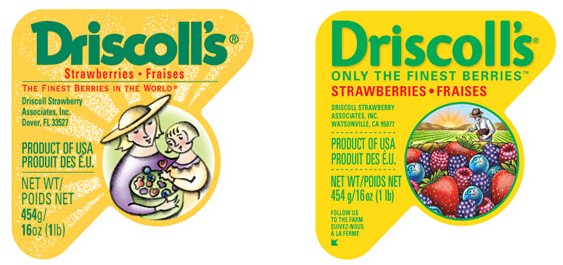
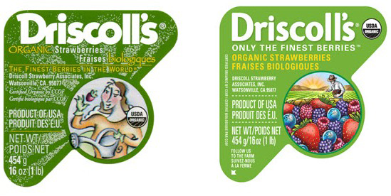
Driscoll’s, the leading provider of fresh berries, unveiled a new logo and label design that will be used throughout all areas of sales and marketing. The new look will begin to hit the U.S. market within the next few weeks.

The new brand identity will be incorporated in various brand communications from labels on individual clamshells, to the trays used to ship the clamshells as well as signage at the company’s headquarters. The new brand identity will unify and strengthen the look of Driscoll’s destination Berry Patch displays in retail stores.

The company tapped San Francisco-based Michael Osborne Design for the task. Osborne and his team retained key brand and label design touch points, such as the familiar triangle shaped label, and the vibrant yellow and green background colors, while restructuring messaging in a hierarchical fashion on the labels. The new label also incorporates an illustration, created by Steven Noble, of a farmer in a field of berries and most important, berries overflowing in a basket.

This is the evolution of this brand,” said Douglas Ronan, VP Marketing at Driscoll’s. “The Driscoll’s brand is one of the most recognized brands in the produce industry. Our heritage is in strawberries. Now, by using all four berries on our package, we are reinforcing our leadership position in fresh berries while highlighting the special efforts of our farmers.”